On December 3, 2015, Pantone announced its much-anticipated 2016 Color of the Year and they dropped a bombshell: it’s actually two colors – Rose Quartz and Serenity. These colors will make an appearance in all areas where style and design are involved, from fashion to patio furniture to wall paint. Here’s the buzz about the Pantone Color of the Year.
Background
Pantone was founded in 1963 by Lawrence Herbert. Herbert created the Pantone system – the Pantone Matching System a.k.a. PMS – out of the need to properly identify, match and communicate colors within the graphic arts culture. “Red” can come in many shades, which was leading to mistakes between graphic designers and printers or other vendors that would eventually create the packaging for a product or the product itself. The PMS helped to prevent those mistakes from happening.
Since 2000, Pantone has announced a “color of the year,” initially designed to be a marketing effort for the company. And it worked: they don’t just print color guides; they consult with leaders in the fashion industry like Donna Karan and even sell their own products for their loyal fans and customers, such as a Pantone mug. They boast more than 89,000 followers on Pinterest and more than 400,000 on Instagram.
Last year, the Color of the Year was the deep, rich shade of Marsala.
2016 Color of the Year
Pantone explains the choice of Rose Quartz and Serenity:
“Joined together Rose Quartz and Serenity demonstrate an inherent balance between a warmer embracing rose tone and the cooler tranquil blue, reflecting connection and wellness as well as a soothing sense of order and peace.”
Here are some of the reactions from around the Internet:
- The Wall Street Journal – Fashion and design columnist Christina Binkley’s initial reaction is that “It’s twins!” as she compares the color choice to the popular baby colors of pink and blue. She later confirms with Pantone that the aim of the colors of the year has nothing to do with baby colors and that Rose Quartz is not the same as baby pink.
- Huffington Post – Associate style editor Jamie Feldman has a similar response: This kind of looks like a baby nursery swatch. She does point out that this choice is a stark contrast to 2015’s color of the year, Marsala.
- The New York Times – Fashion industry journalist Vanessa Friedman buys into the political and social reasoning behind it that Pantone provided: “a soothing sense of order and peace,” which is particularly relevant in a rather turbulent time for world and domestic politics. She speculates that at some point, if politicians get wind of the colors’ symbolic meaning, we could see dress ties of blended Rose Quartz and Serenity instead of the classic blue and red at upcoming debates and public appearances.
How to Use the Pantone Color of the Year
If you’re thinking about how you’ll incorporate this into your outdoor living space, here are some ideas for how to do it:
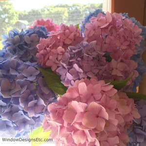
- Landscaping – The easiest way to work these colors into your landscaping may be using hydrangeas.
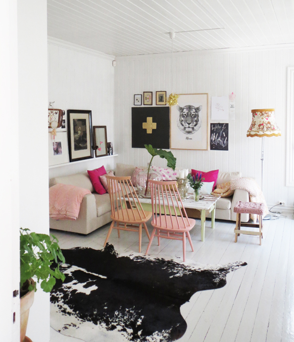
- Patio Furniture Accessories – Throw pillows, rugs and ottomans are the best way to spruce up your patio furniture with the latest and greatest
- Patio Furniture Painting – If you have wooden patio furniture – or wooden indoor furniture such as chairs – you could paint it between now and spring, and be ready to host picnics and get-togethers while showing off Pantone’s colors.

If you happen to be in the market for high-quality, long-lasting, durable patio furniture, see what Fifthroom.com has to offer.
0