For the first time ever, Pantone has given us an even dozen (instead of their normal “ten”) Leading Colors for Spring. And, according to Pantone Color Institute executive Director, Leatrice Eiseman, many unexpected shades made the list for Spring, 2018. Eiseman attributes this to a world of industrial product design which is finally opening up to the idea of using more color. Hurrah! Out with the black and gray and in with color! Here are the Pantone’s Trendsetting 12:
Meadowlark 13-0646 Meadowlark is an ultra bright yellow which makes perfect sense for spring. This shade of yellow is meant to draw attention to itself whether it be in a product or piece of apparel.
Cherry Tomato 17-1563 Another strong color, this is a heated, dynamic color with orange undertones. Striking in any utilization.
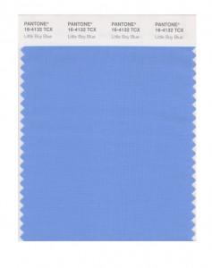
Little Boy Blue 4132 This clear blue sky inspired tone is predicted to be a favorite of designers in Spring, 2018. Blue works for everyone, young, old, male and female.
 Chili Oil 18-1440 This fiery red-brown shade was a surprise entry onto the 2018 list. Because of its intensity, it is seen as that “bit of spice” which gets used in wardrobe or decor to make an impact.
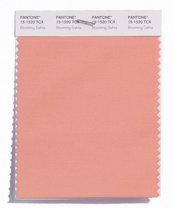
Blooming Dahlia 15-1520 Blooming Dahlia is in the orange family and is a softer color which is reminiscent of the flowers it is named for.
Pink Lavender 14-3207 This rose-hue is quietly striking and is guaranteed to be seen in fashion on spring runways everywhere!

Arcadia 16-5533 A softer, more natural shade of green than Pantone’s 2017 Color of the Year, “Greenery,” Arcadia is a tip of the hat to the public’s interest in all things natural.Ultra Violet 18-2828 Jewel-toned Ultra Violet is a blue-based violet and designers feel it is a “wonderfully imaginative” color for Spring. It’s truly a “notice me” color. No wonder it has just been named Pantone’s 2018 Color of the Year!
Emperador 18-1028 This rich, chocolate brown is an earth tone which is somber but not so sinister as black. Some designers feel it is “Game of Thrones” inspired.
Almost Mauve 12-2103 Gentle and ephemeral, this “barely there” pastel is reminiscent of a more innocent, romantic time.
Spring Crocus 17-3020 Another member of the purple family (do you see a theme developing here?) this pink-purple shade is flattering to any complexion.
Lime Punch 13-0550 If you’re into neon, you’ll love Lime Punch. Athletic designers are all over it!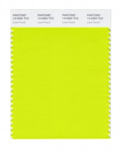 As you are thinking about new looks for your home in 2018, check out Pantone’s 2018 Spring Colors. One of them might be just what you’re looking for!
0